

About us
We invest in human flourishing.
An endowed organization using grants, loans, and investments to build an economy where more people can participate, contribute, and thrive.

/about hero is 804px of near-empty navy waiting on a background asset, with a loading spinner visible mid-viewport. This one resolves instantly because the LCP element is a real photograph.Squarespace build: a two-column section, left text block, right image block. Set the image block to
Fill at a 4:5 crop. No code needed.The one code item: the manifesto link carries
?utm_source=site&utm_medium=invitation&utm_campaign=inv-all-manifesto. Every outbound link on this page is tagged the same way. That is foundation F1 in the invitation matrix, roughly an hour of work, and it is what makes "is the About page working harder?" a number in GA4 (property G-J78S6LWX02) instead of an opinion.Dropped on purpose: the "10 Years of Empowering Change" headline. Anniversary framing has an expiry date. "A decade in" survives as body copy further down.
Capital as a tool, not a transaction.
We began as a small, community focused team, ready to act. A decade in we still work the same way: close to people, close to place, and willing to move first. The team is distributed now, and the work goes where it is needed, including the community you are reading this from.
We practice a one pocket approach. Every asset we hold, from first check grants to market rate investments, is aligned with one mission. Financial return and human impact live in the same portfolio, or the portfolio is not doing its job.
Needs Bryce's sign off, since storytelling is his call. Everything else in this file is execution.
Three commitments
Flourishing is shared, not solitary.
The postures we bring to every investment, program, and partnership.
Access
Capital is the scaffolding of opportunity. We work to expand the conditions for participation, so more people can contribute their ideas and their work.
Agency
Access alone is not enough. Flourishing requires the freedom to act on it, so we align capital with people and place rather than with our own control.
Risk
We hold risk faithfully, not fearfully. Fear shrinks imagination, and the first check is usually the one nobody else will write.
/about-2026-rework. That is the problem, not the feature. Twelve links that need a human to review them forever is Bryce's staleness objection in physical form, and he raised it four times in the 20260708 thread.We already own the fix.
injections/portfolio-post-item.html and injections/blog-post-item.html (v1.10.0, live on /blog and the three past projects collections) read a post's categories, fetch /blog?format=json&category=<theme>, score shared categories x2 and tags x1, render card rows, exclude the utility posts, and fail silently when there is nothing to show.What to build: a trimmed variant of that script,
injections/about-theme-rows.js, that walks every ul.stories on this page, reads data-av-theme, fetches the three most recent posts in that category, and replaces the list contents. Three fetches on one page, all cacheable.Keep the hardcoded markup in the page as the fallback. If the fetch fails, the reader still sees three good posts. Same fail-open discipline as the tag filter.
Maintenance answer for the memo: automatic. Nobody touches it. It improves on its own as the retag lands.
auto-explore-off style pinning stays available if Bryce ever wants a specific post locked into a slot.--av-grad-teal, --av-grad-gold, and --av-grad-blush plus --av-grain already exist in the compiled CSS. They came out of the 20260703 flip card work, where flat brand fills read too bold at 6.1:1 and the lightened gradients with navy text landed at 8.8 to 10:1. Reusing them here is continuity, not a new pattern, and it means the commitment cards can share a visual family with the interaction study if that ever ships.Figures from Building a Thriving Regional Capital System.
#FDFDFD text on linear-gradient(135deg, #E79F36 0%, #FDFDFD 48%, #90E2EB 100%). Measured against that gradient: 2.19:1 over the gold end, 1.07:1 at the white midpoint where "$14.55M" actually sits, 1.45:1 over the teal end. WCAG AA needs 4.5:1, or 3:1 for large text. The headline number and the "TOTAL FUNDING DEPLOYED" label are invisible on a real screen, which is why the band currently reads as a blank rectangle.This version uses navy
#07304C on --av-grad-gold: 6.13:1 at the gold end, 13.44:1 at the light end. Passes everywhere, no gradient change needed.This is the second time this exact failure has happened (flip cards, July). It recurred because the fix was never written down. Two lines belong in
av-brand-guidelines.md: text on a brand gradient is navy or dark maroon, never white; and check contrast at the gradient's lightest stop, not its average. Same note should add that warm gray #857774 only passes AA at 18px and up, since it measures 4.22:1 on white and 3.64:1 on blush.Also cut: the four small stat cards below the band, and the "XX Portfolio companies and funds [confirm count]" and "[Add as-of date]" placeholders that are live in the rework right now. Three real figures beat five competing ones, and an as of date needs to be a real date before this ships.
A portfolio built for people and place.
From first check grants to fund investments, each holding is the thesis in practice.







Squarespace build: one Code Block. The CSS is
animation: slide 42s linear infinite on a width:max-content flex track with the logo set duplicated so the -50% translate loops seamlessly. Paused on hover, and it collapses to static under prefers-reduced-motion. The duplicate set carries aria-hidden="true" and tabindex="-1" so screen readers and keyboard tabbing only ever see one copy.Every logo links to its real
/past-projects1/... page. Once those post pages carry categories, the portfolio post template's own Keep Exploring section takes over from there, so this section quietly feeds traffic into the system we already built.Only one marquee on the page. Two reads as filler.
A small team, close to the work.
Meet the whole team


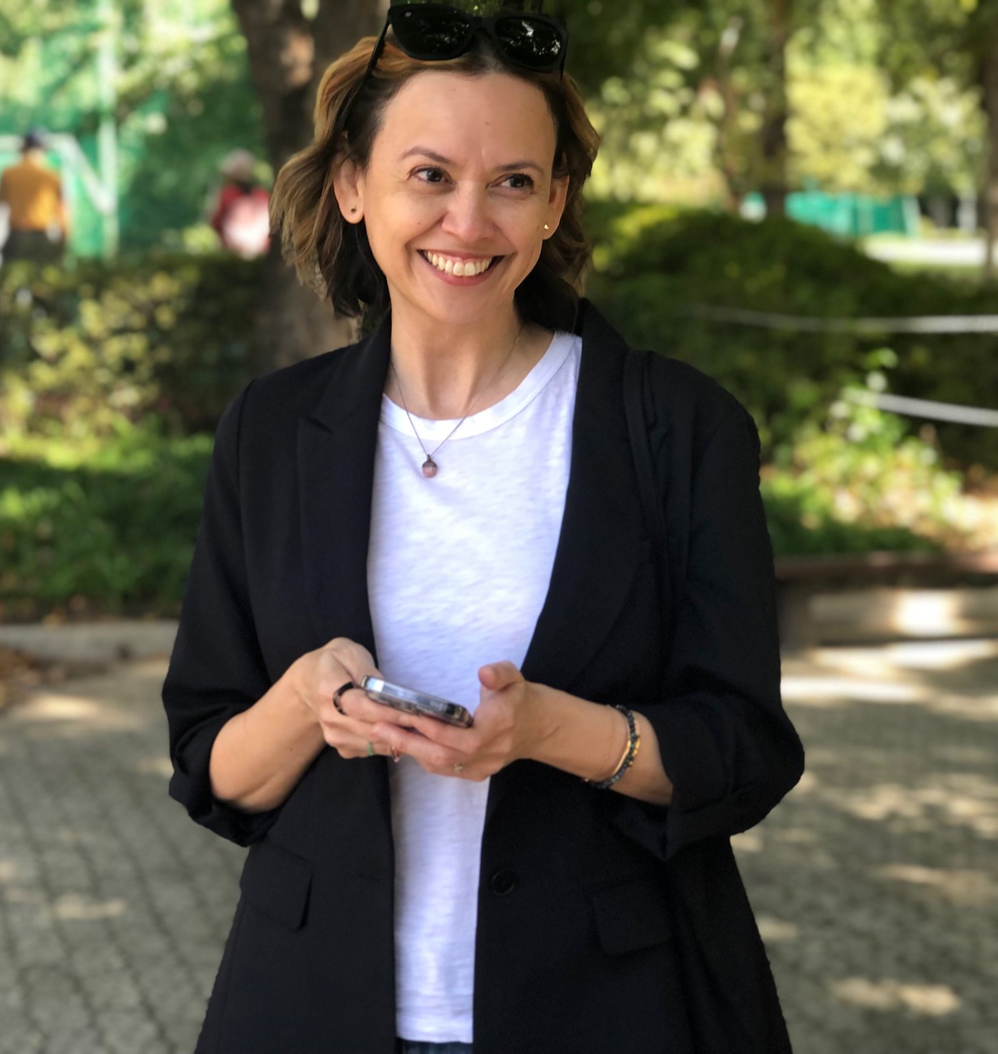

/about gives 3,409px of 8,660px to eleven bios. On the page where someone decides whether we are worth a second look, evidence should outrank headshots, and /team already exists to introduce people properly.This is decision 1 for Bryce. Recommendation is a strip plus a link. Default if he does not reply: ship the strip.
Three live defects to fix at the source, not here. Meghan, Madison, and Stacey's bios were duplicated from a template and never slugged, so they still resolve to
/team/bio-page-template-r83s9, -gn5jp, and -xj9kk. That shows on About, on the rework, on /team, and in search results. Aleks is still on the roster and is departing; Diana is absent. Fix the slugs, set redirects, correct the roster, and add a roster line to the monthly audit so it does not drift again.Stay connected
Come along for the work.
Stories, lessons, and invitations from the work of human flourishing. About once a month, no noise.
Have something specific in mind? Send us a message.
What exists: the Access Ventures audience (2,828 contacts, dc us8), admin access, and an API key.
What does not: interest groups. There are zero, everywhere. Every send today goes to the full list.
Build (F2, about half a day): create five Mailchimp groups matching the five checkboxes, embed the real Mailchimp form action in place of this mockup form, and keep the hidden
SOURCE field so we can tell an About page signup from a blog footer signup. Those five names are the topic list Bryce approved. The broad newsletter stays the default; a checkbox is the specific yes.Quick win while you are in there: the welcome automation is paused. Turning it on costs one click and is the highest leverage thing in that account.
Decision 3 for Bryce. "Send us a message" is demoted here: it sits under the newsletter as a quiet line rather than being the page's only ask. It has had no named owner since May, and row 8 of the matrix is explicitly gated on naming one. Either he names someone or it stays demoted.
Form accessibility: labels above inputs, no placeholder as label, gold focus ring at 2px with offset, helper text before the button, and the whole form is navy grounded so every text element clears AA.
IntersectionObserver with unobserve after firing. No window.addEventListener('scroll') anywhere, no scroll position in state, only opacity and transform so it stays on the compositor. The whole thing collapses to static under prefers-reduced-motion.Motion is set low on purpose. The live site barely moves, and this is a preserve level redesign, not a rebuild.
Squarespace note for the CSS partial: Custom CSS compiles through LESS, so any
calc() with mixed units must be written calc(~"...") or the rule is silently dropped. Also, About is a standalone page, so it is inside the 7.1 DOM change that went GA on 20260723. Nothing here reaches a section with > from main, so the new .region wrapper is harmless, but keep it descendant only.Loses: it still assumes a reader who scrolls. If the nav changes so About becomes a top level destination that people hit on purpose and leave from quickly, version B is the better shape.
Open, and upstream of all three: Bryce floated About / What We Do / News and Stories as the main nav on 20260708, and "About Us nav" is still an open task. That call changes this page's job. It should be decided in the same conversation or we rebuild.